Ice Owls PWHL Brand Design
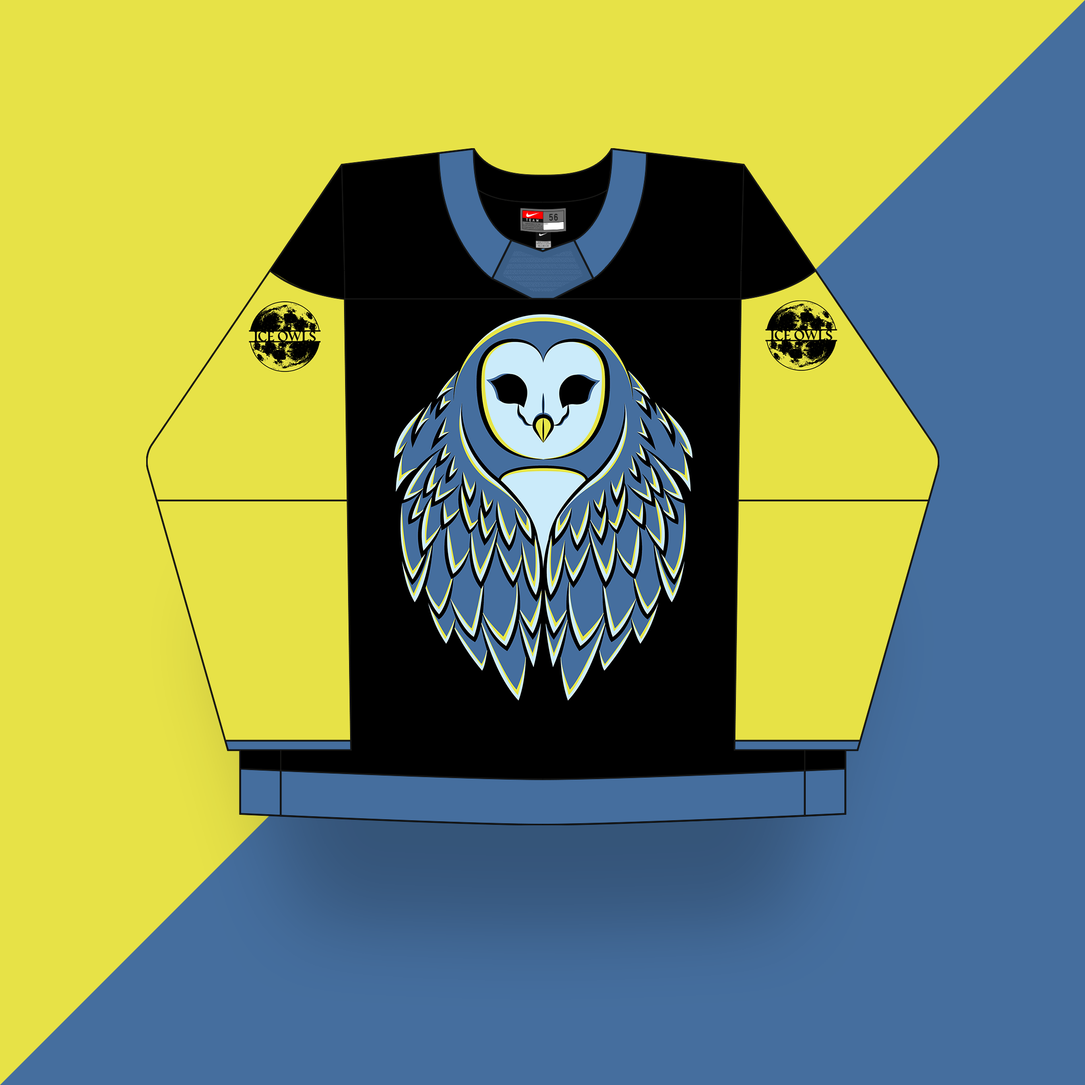
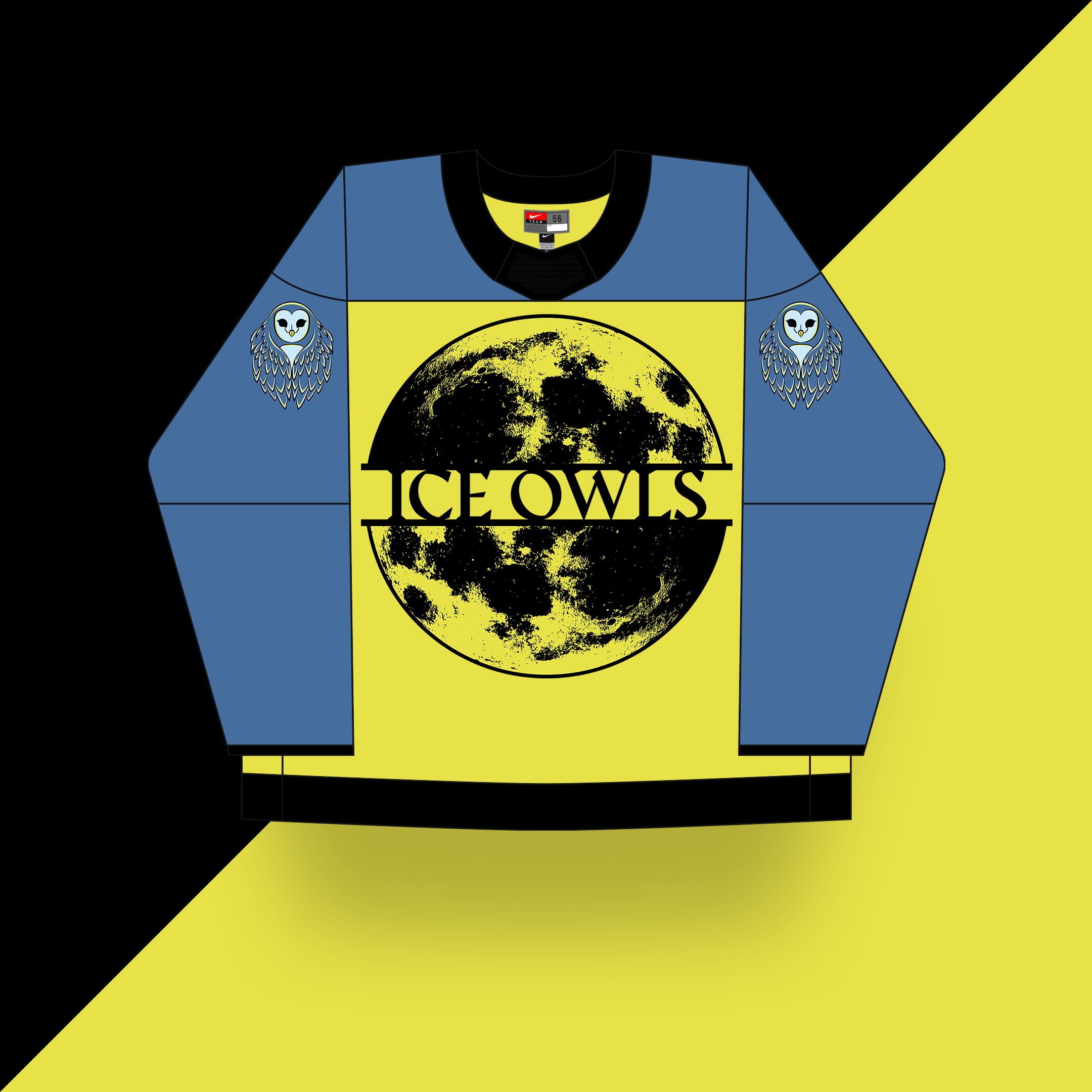
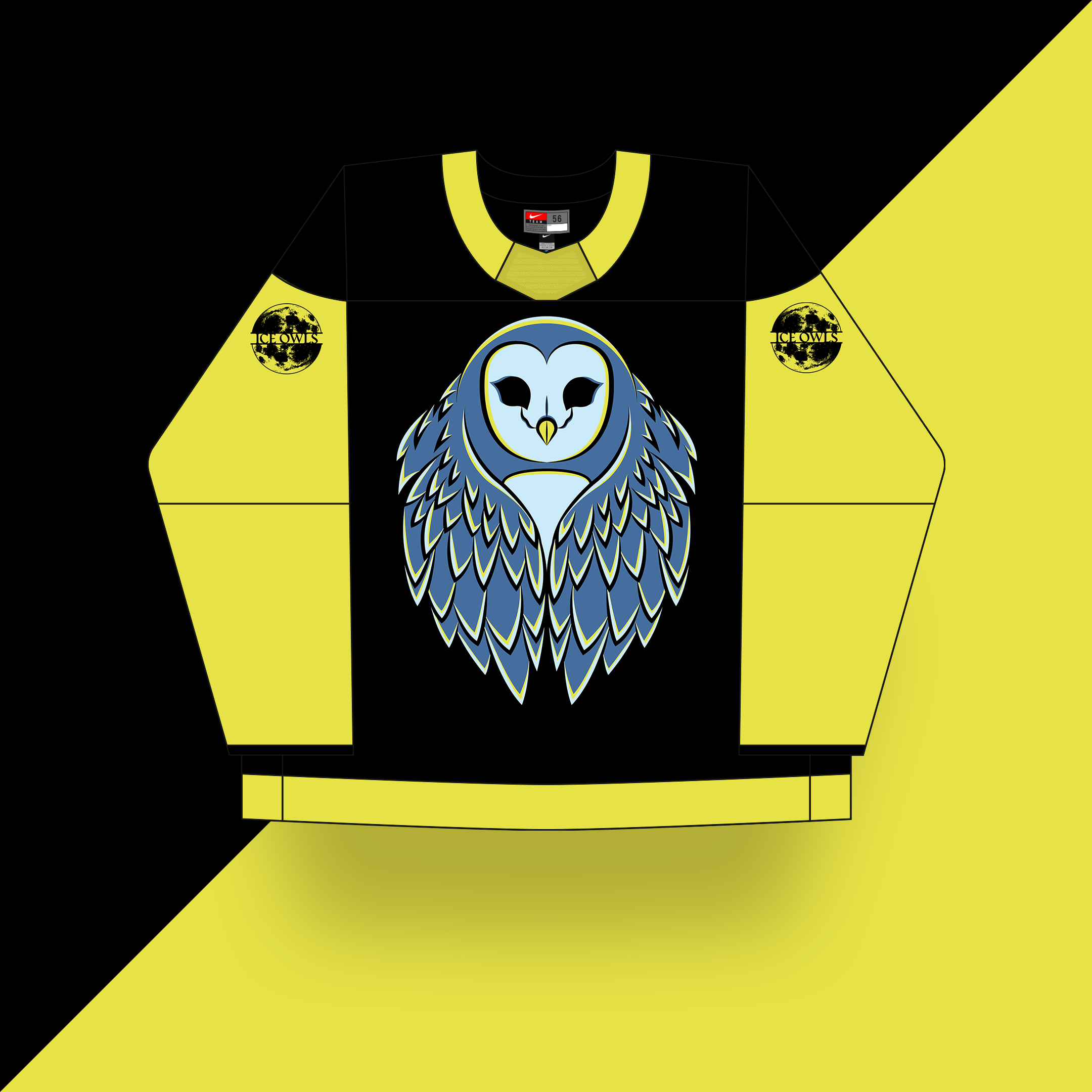
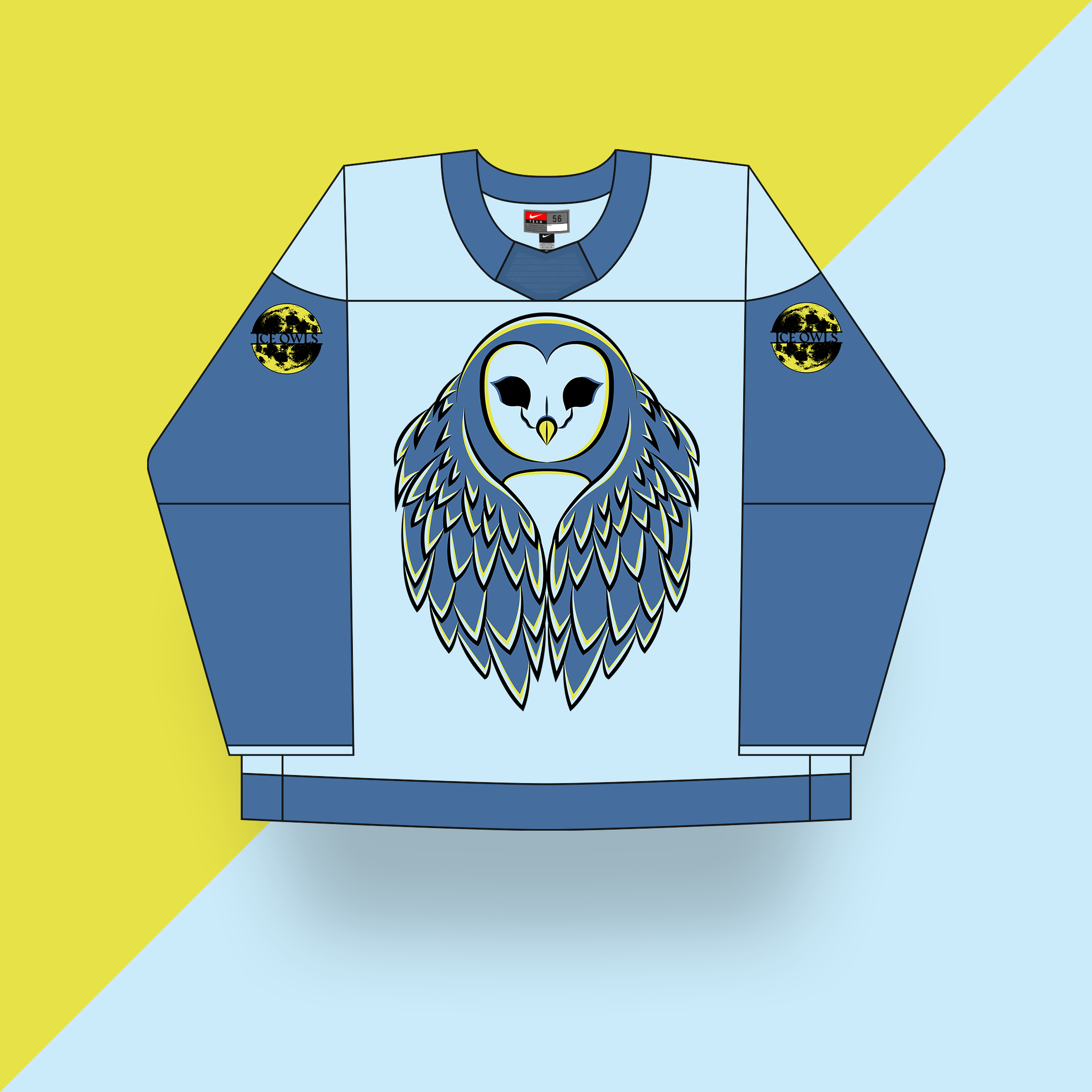
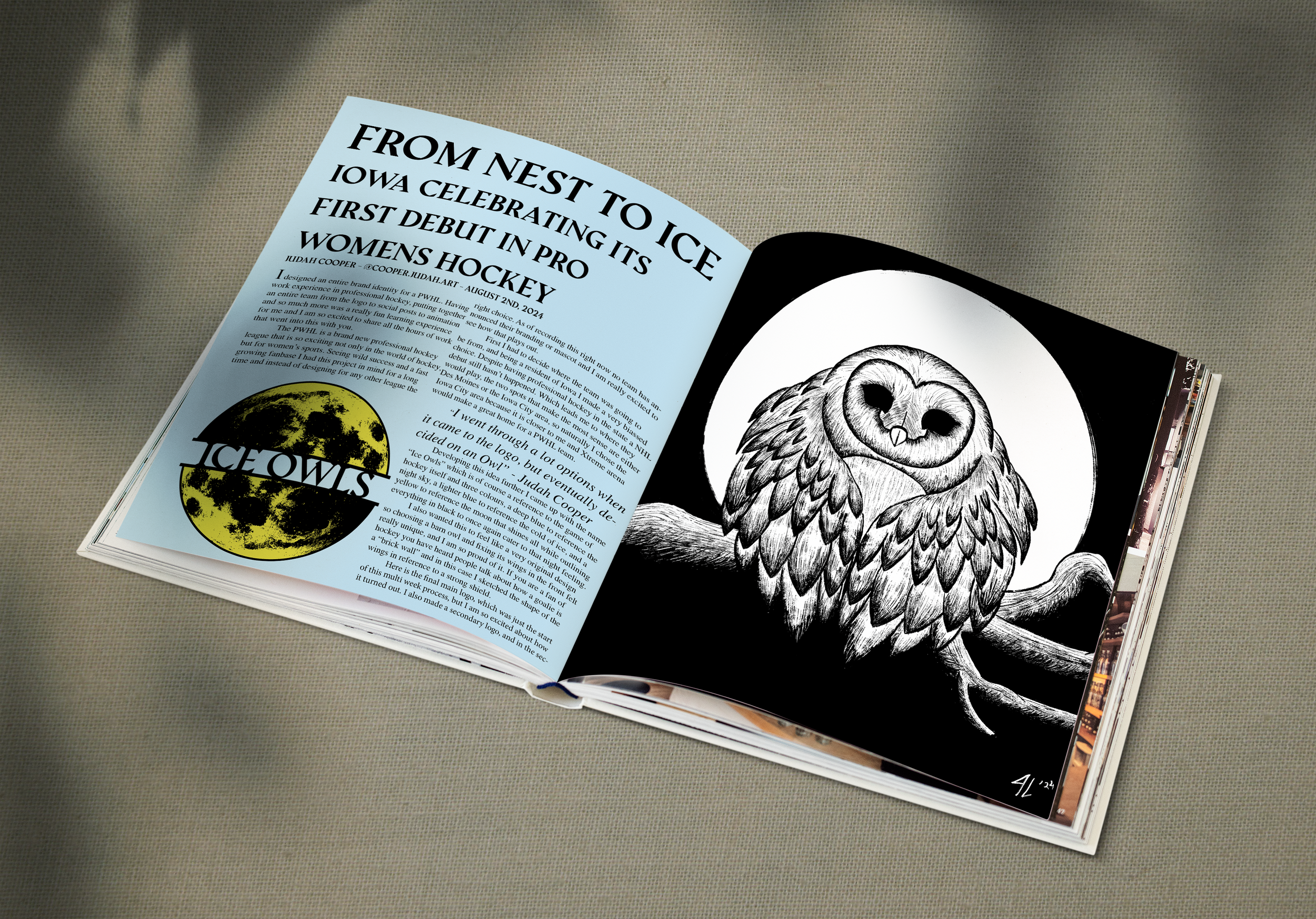
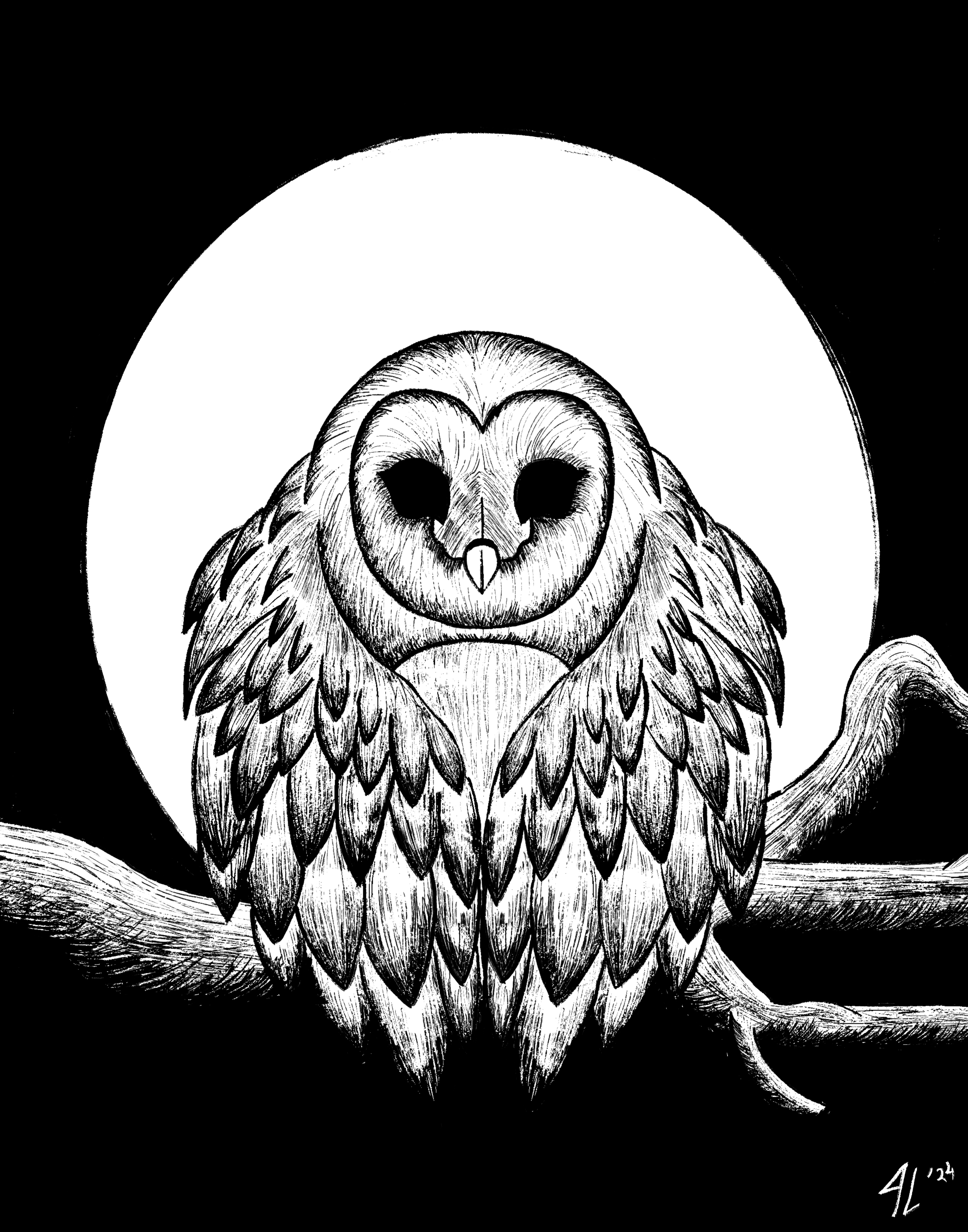
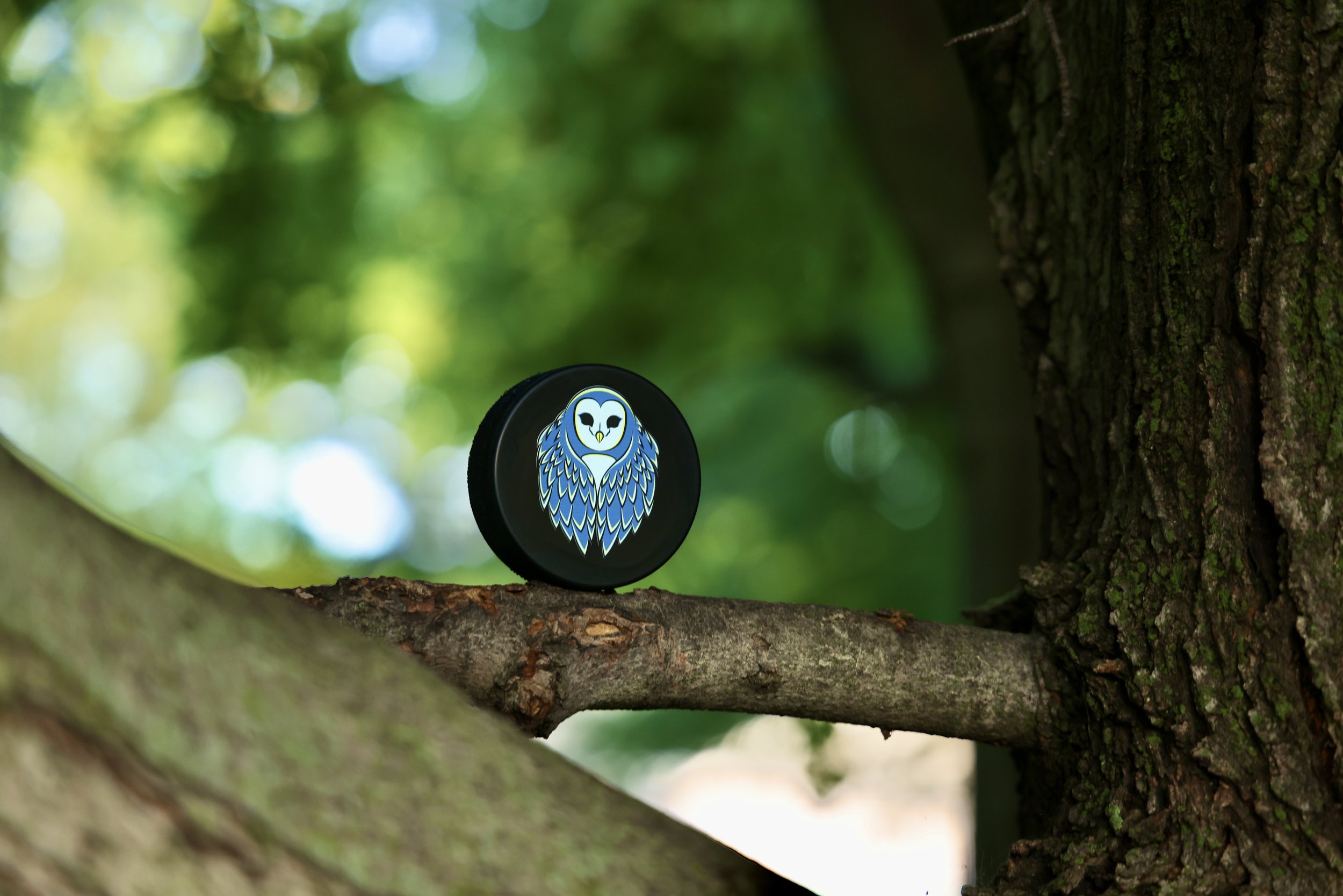
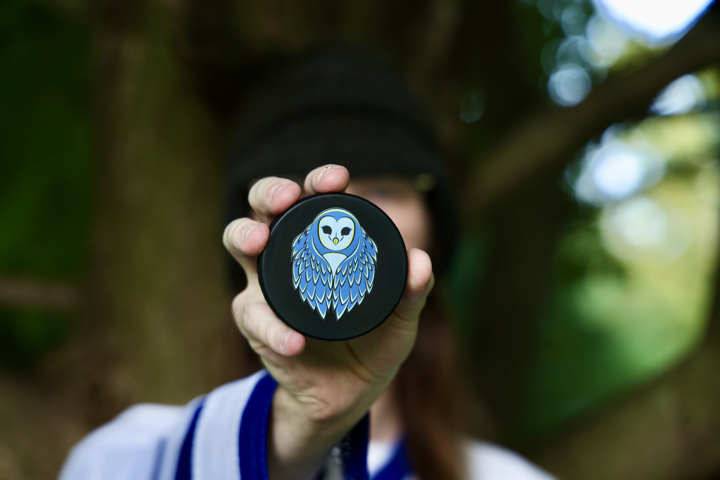
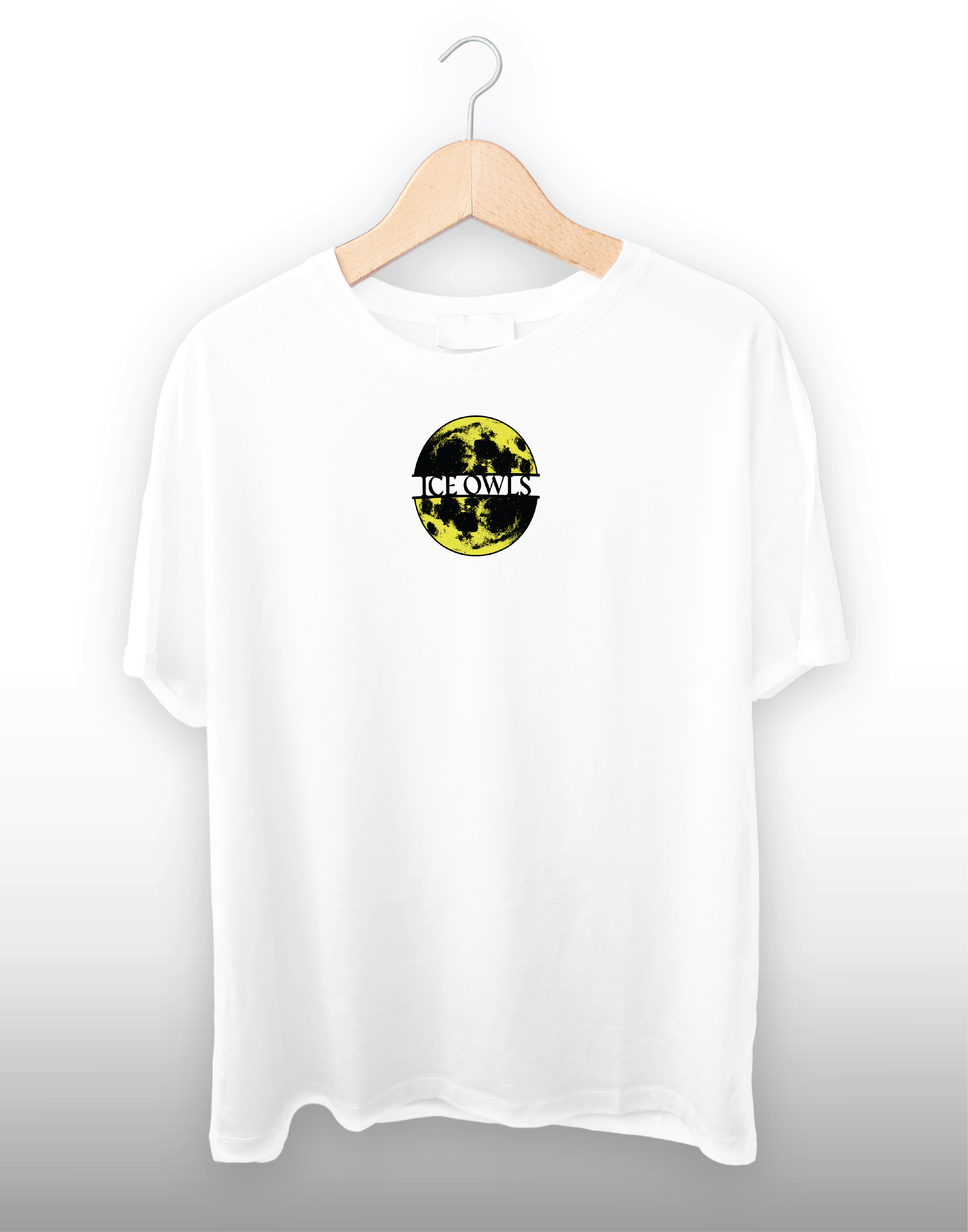
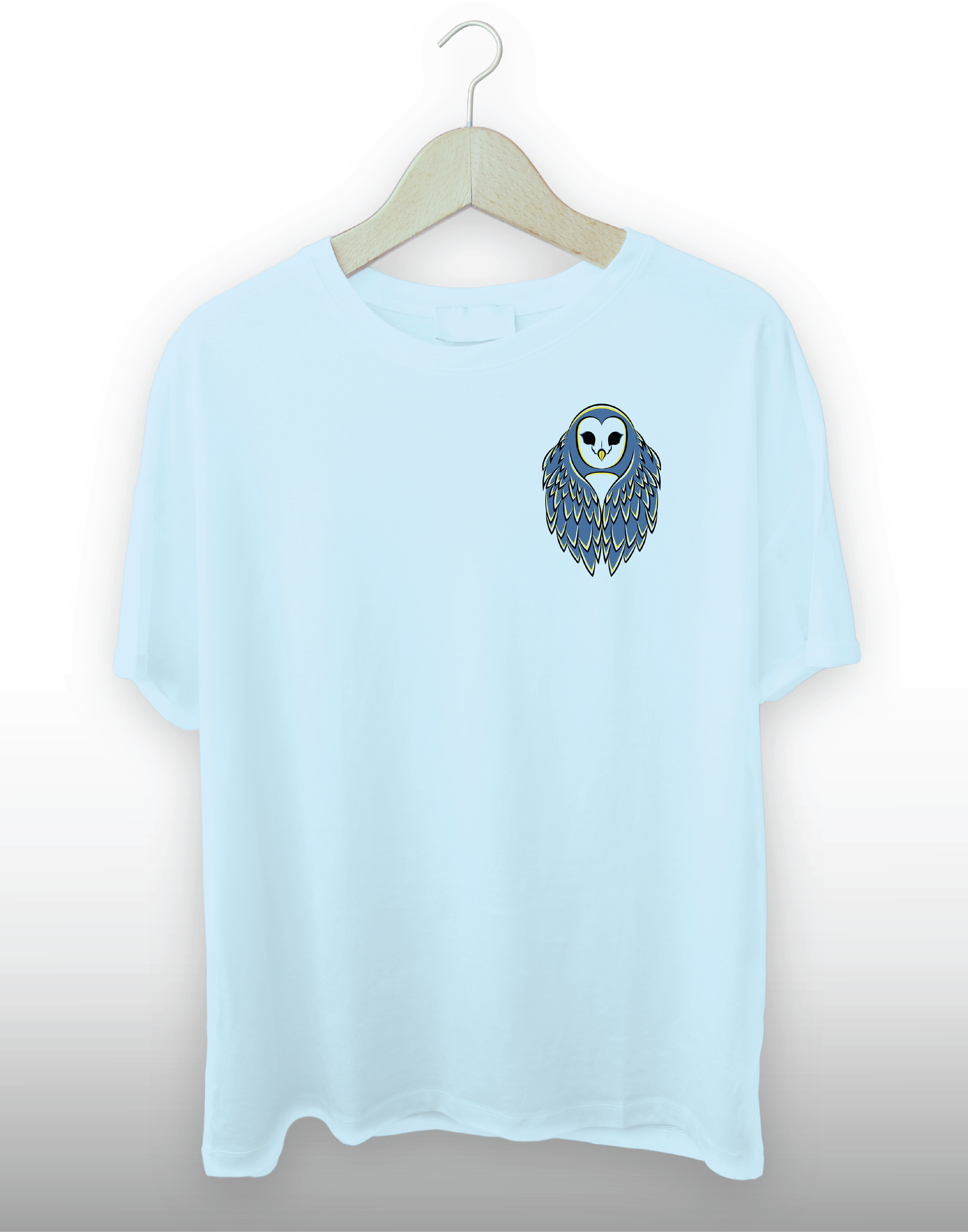
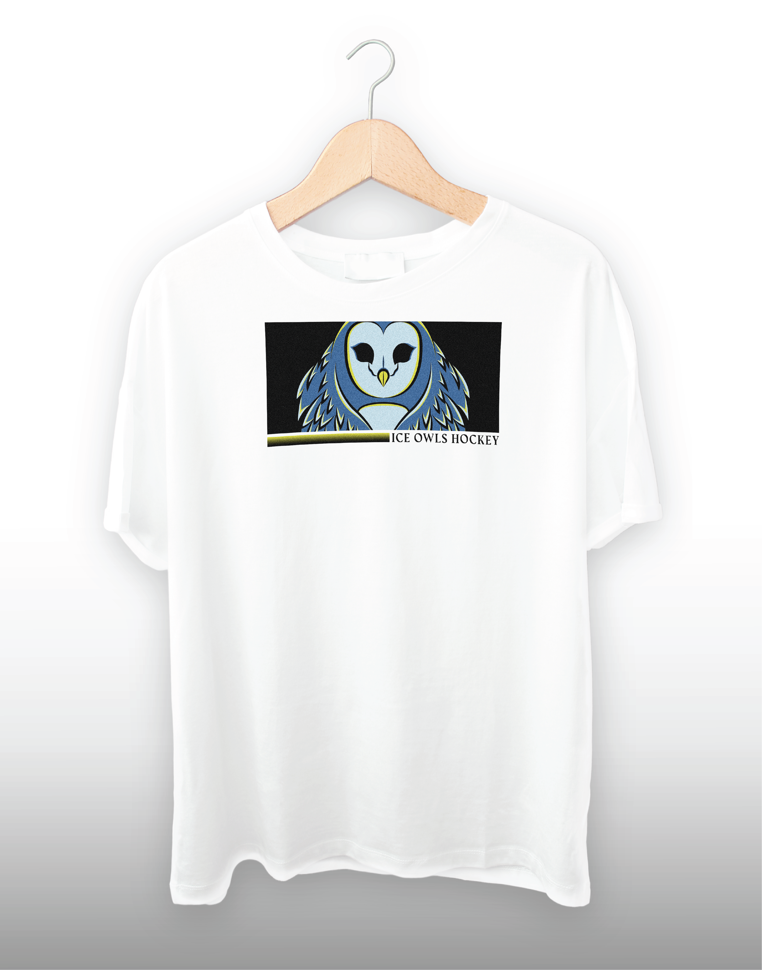
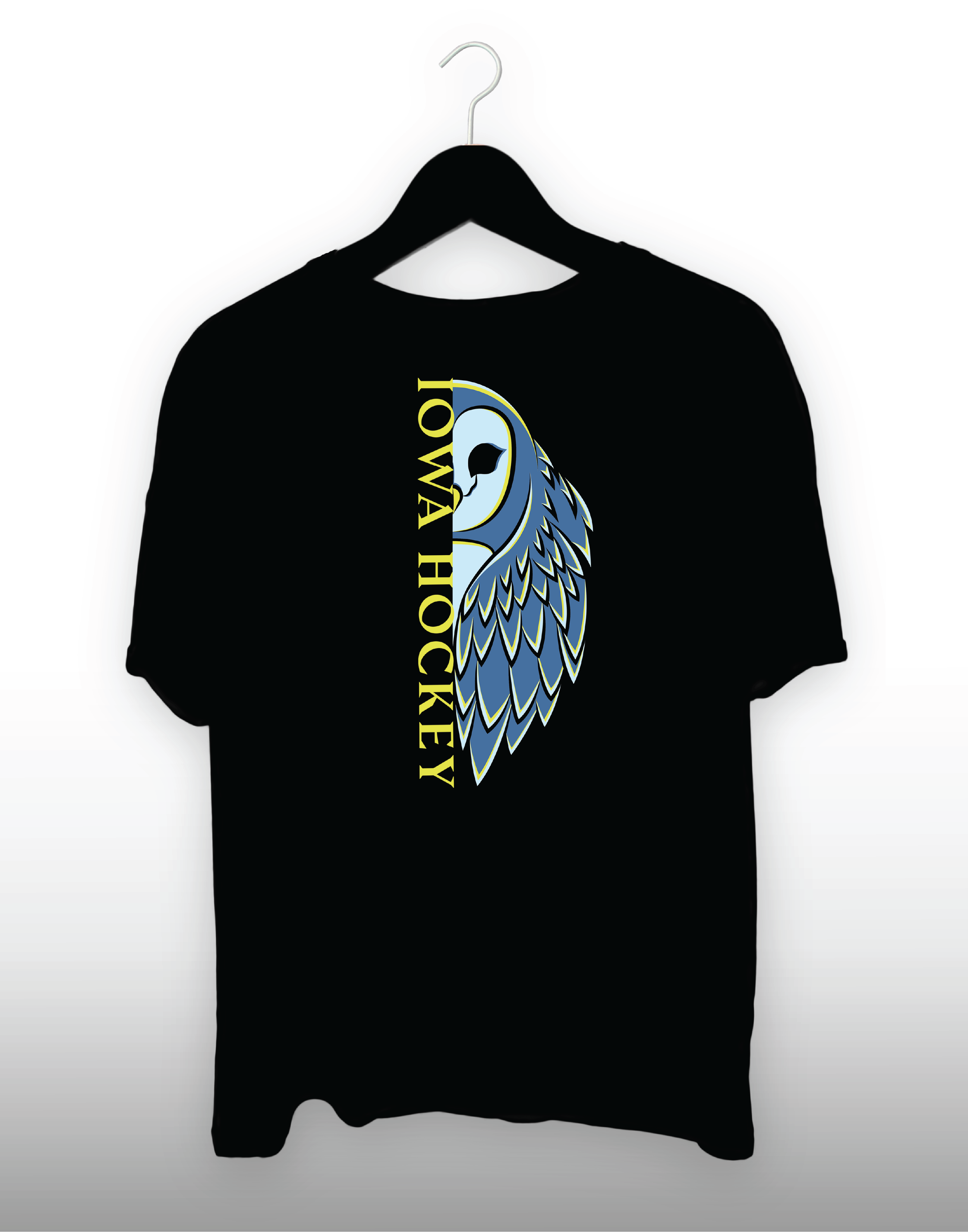
I am so excited to share this personal project! It took so much time, was so challenging and was extremely fun! I used a massive variety of skills that I have acquired and honed over my years of design to complete this project. The PWHL was such a fun organization to make a mock design for. I explored a number of options when creating the logo, but eventually decided on an owl. The owl has close ties to the area and I feel it is a representative of Iowa. Most Iowans know what it's like to sit around a bonfire with your friends when an owl decides to let you know it's around in one of the trees. Developing this idea further, I came up with the name “Ice Owls”. This is a reference to the game of hockey itself and three colors I selected for the logo. A deep blue to refers to the night sky, a lighter blue to symbolizes the cold of the ice rink, and a yellow to represent the moon that shines. Ultimately, the logo is outlined in black to once again cater to that night feeling. I have a video explaining every single digital asset that I put together to compete this project. I hope you enjoy and take the time to check out the rest of my page as well!
